What We Learned Building Pray Work Sleep's Website
A look back at the boxing gym project — what worked, what we'd change, and what it taught us about brand-first web design.
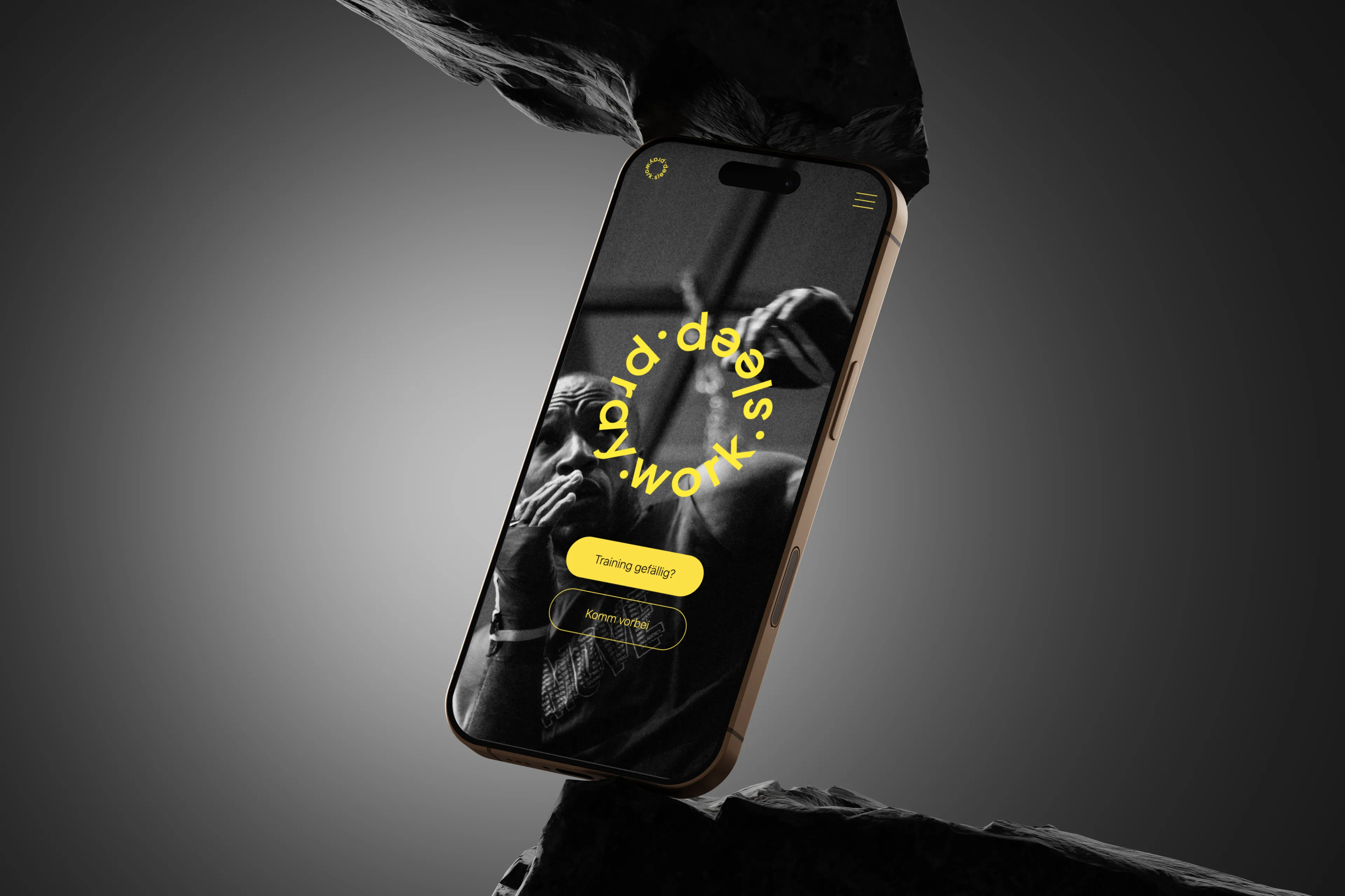
Pray Work Sleep needed a website that felt as disciplined and energetic as the gym itself, in a Zürich fitness market where most competitors' sites looked interchangeable. The brief was less about features and more about tone — the site had to feel credible before a single word was read.
We leaned into strong typography, a tight dark palette, and minimal but purposeful motion, rather than trying to cram in every possible feature. A gym website doesn't need to do much; it needs to make someone want to walk through the door.
The biggest lesson carried into every project since: restraint is a design decision, not a lack of one. Knowing what to leave out was more important here than anything we added.