Color Psychology in Branding: What Your Palette Says
Color choices aren't just aesthetic — they're the fastest signal a brand sends before anyone reads a single word.
Before a visitor reads your headline, they've already reacted to your color palette. Blue reads as trustworthy and calm — which is why it dominates finance and healthcare. Green reads as natural or growth-oriented. Warm reds and oranges read as energetic, sometimes urgent.
None of this works as a rulebook, though. Context and industry expectations matter more than any universal color meaning — a bold, saturated palette can be exactly right for a boxing gym and completely wrong for a wellness clinic.
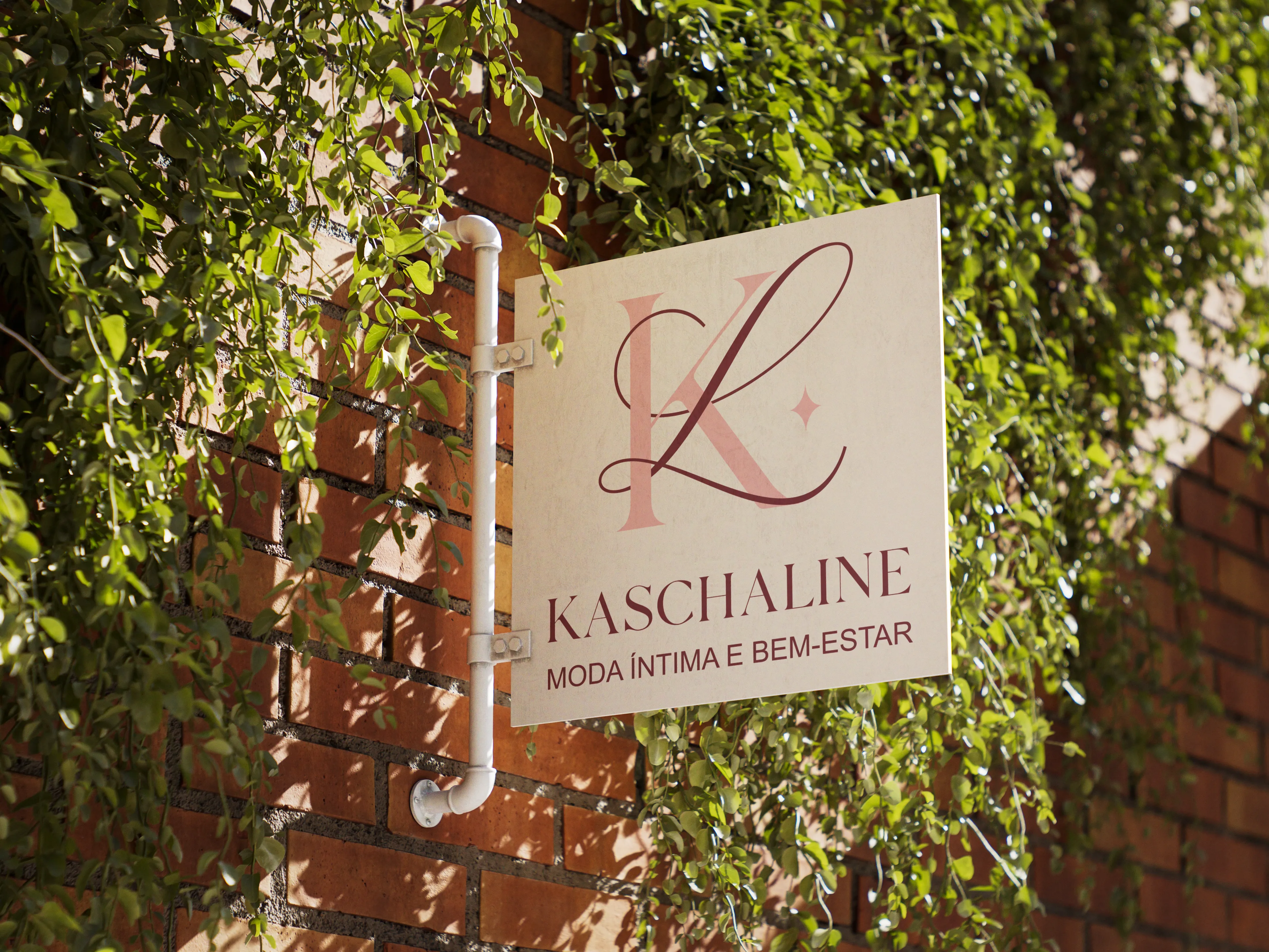
The real work in choosing a palette isn't picking colors that 'mean' the right thing in isolation — it's picking a palette that holds up across every real use case: a website, a business card, a social post, a signage board, in daylight and on a phone screen at night.